 Healers World














































VAASTU WORLD · COLORS
Vastu for Home Colours
The existing source map does not prescribe a room-by-room paint palette, so colour suggestions here are common practice. Choose colours for daylight, upkeep and the people using the space. Use the cited room and openness principles to understand placement separately; choose colours in keeping with the tradition’s associations and the room’s everyday use. Best direction: Varies by room.
Read the guide
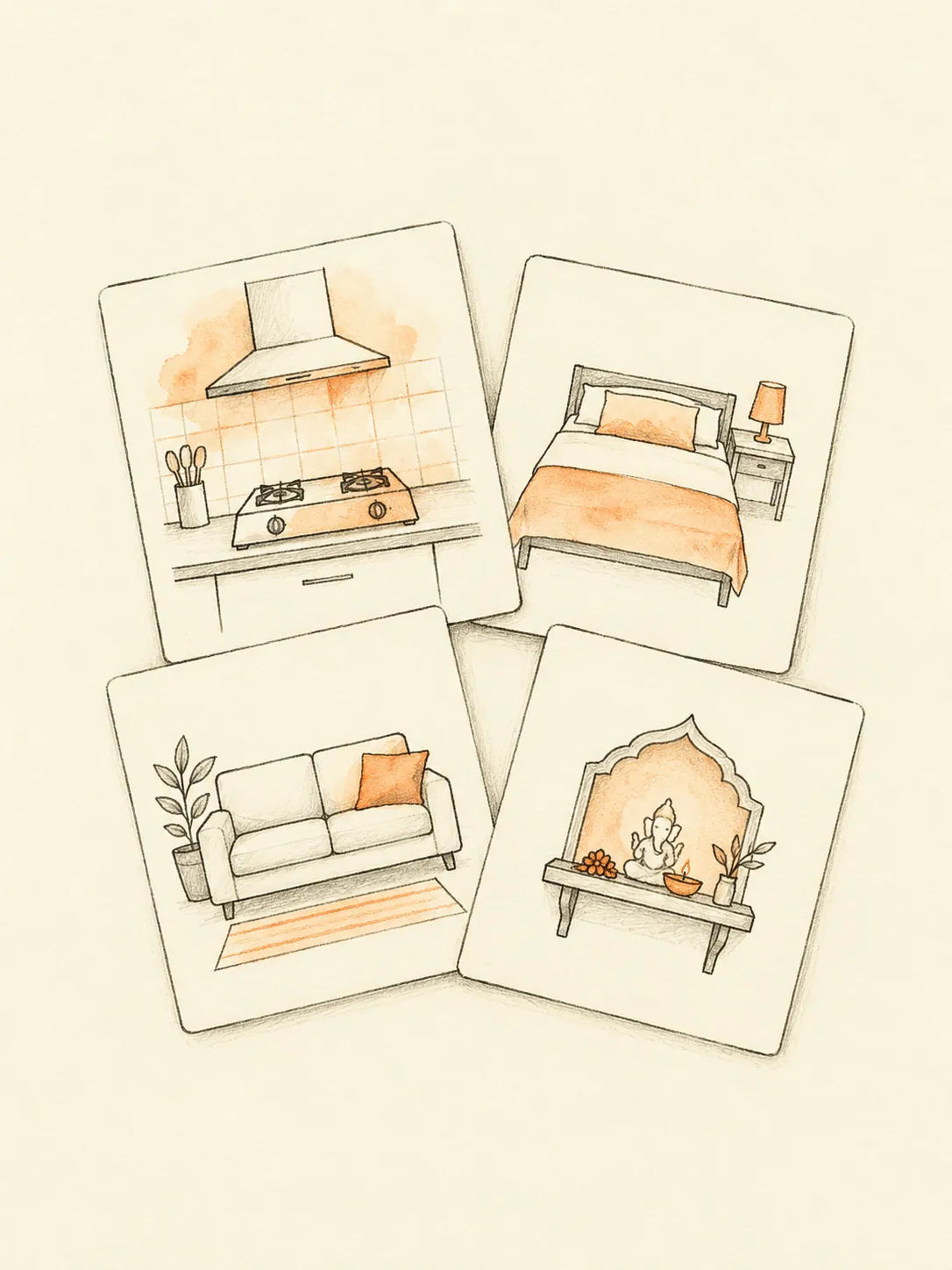
By the Vaastu World editorial team. Last updated 4 October 2026. No named expert has signed off this guide.
Key Vastu tips
01Common practice: An ideal colour choice for practical use depends on the room's light, surfaces and daily activities. This guide does not give paint colours a fabricated classical citation. The sourced rules below concern kitchen placement, prayer-room placement and the interpretation of an open centre. They help identify those questions independently of decoration. Common practice is to start with a small sample and view it in the actual room. A shade that appears balanced in a reference photograph can look very different under your window light or evening lamps.
02Common practice: An acceptable palette may use the colours already present in rented walls, flooring or furniture. Common practice is to work with those fixed finishes before purchasing replacements. In a darker room, compare how samples affect visibility; in a bright room, check glare and the appearance of large reflective surfaces. For a kitchen, maintainability matters when choosing finishes near preparation areas. For bedrooms, ask the occupants which combinations feel comfortable. These are practical preferences and should not be called a verse-backed direction-to-colour system when that system is absent from the source map.
03Common practice: Practical cautions include coating an unsuitable surface, covering ventilation openings and choosing a finish that cannot be maintained in a wet area. Check the product's application instructions and the actual substrate. A sample image does not show moisture condition, existing coating or installation requirements. Do not undertake repairs around damp surfaces by disguising them with a decorative finish instead of examining the cause.
Dos and don'ts
Dos
- Common practice: Begin with reversible colour trials: use sample cards, a removable textile or a small permitted test patch. Compare the choice during daylight and evening use. Move a bright accessory if it creates distracting reflections near a screen. Where a directional issue concerns heavy storage or a blocked route, reorganize that feature rather than expecting repainting to address it. Permanent coatings can involve preparation and ventilation requirements, so follow the relevant product guidance. In a rented home, establish permission before altering fixed surfaces or finishes.
- Common practice: Use the Floor Plan Studio for room placement questions, and keep a separate colour note for practical decoration choices. Mark the real kitchen, prayer area and centre so those sourced comparisons do not become paint recommendations. Photograph samples in consistent light if it helps compare them, but do not treat colour photographs as direction measurements. Choose one manageable trial and check whether the finish suits normal use and upkeep. If a wall needs structural or moisture repair, obtain the relevant professional assessment before deciding how to decorate it.
Don'ts
- Common practice: Practical cautions include coating an unsuitable surface, covering ventilation openings and choosing a finish that cannot be maintained in a wet area. Check the product's application instructions and the actual substrate. A sample image does not show moisture condition, existing coating or installation requirements. Do not undertake repairs around damp surfaces by disguising them with a decorative finish instead of examining the cause.
- Common practice: One common mistake is buying paint before checking it beside the existing floor and furniture. Label any uncited directional colour advice common practice. Record the room use, daylight and practical maintenance needs before considering a palette. A South-East room does not acquire a new citation simply because it is painted warm colours. Keep each sourced placement statement attached to the rule it actually concerns.
Frequently asked questions
QAre these colours classical prescriptions? — The source map has no room-by-room paint table. Common practice: choose finishes for light, upkeep and occupant preference without assigning an invented chapter or verse.
QCan painting change a room’s Vastu zone? — Common practice: paint changes the appearance of surfaces. The room’s zone still depends on its boundary and the north reference used in the plan.
QHow should I test a colour in a rented room? — Common practice: compare removable samples or textiles in real light, and obtain permission before applying paint or altering a fixed finish.
QWhat if a wall is damp? — Common practice: investigate the cause with the appropriate professional. Decorative paint is not a substitute for resolving an actual building maintenance problem.
More Vastu guides
Get your personalised Vastu report
Use the Vastu scanner to analyse your home floor plan room by room and receive specific, classical remedies tailored to your space.